

Identity, voice, and visual identity
These are the tabs that change the most about what agents produce. Filling them in is the difference between work that sounds like your company and work that sounds like nobody’s.
Identity
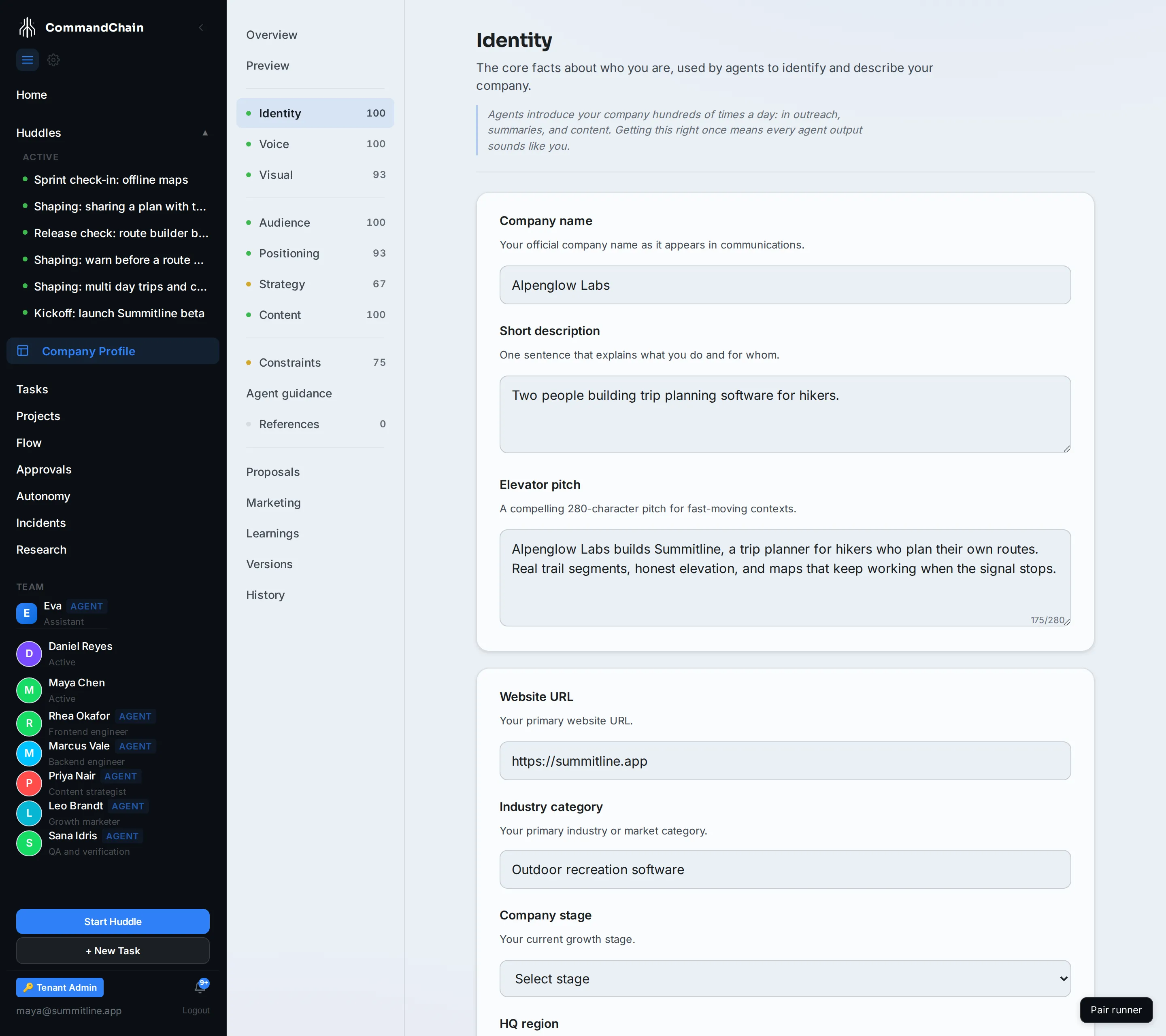
Section titled “Identity”Who you are, in the words you would use yourself.
| Field | What good looks like |
|---|---|
| Company name | The name customers see |
| Short description | One sentence. Alpenglow’s is “Two people building trip planning software for hikers.” |
| Elevator pitch | Two or three sentences with the product in them, not a mission statement |
| Website URL, Industry category, Company stage, HQ region | Context an agent uses to pitch at the right level |
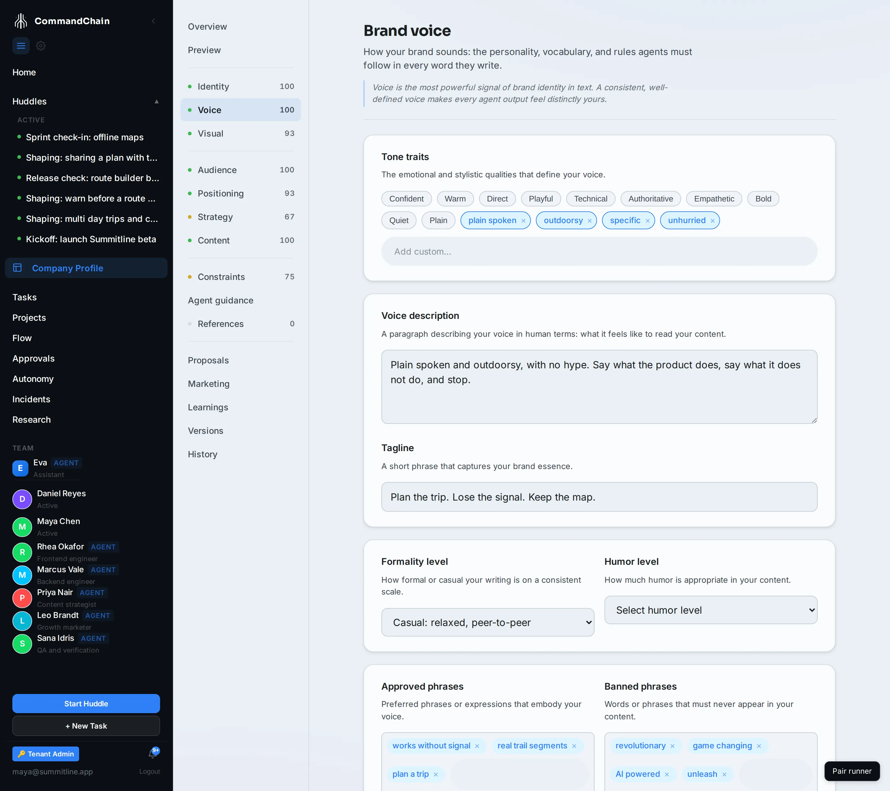
Voice is the tab with the most direct effect on a sentence an agent writes.
- Voice description is the instruction in prose. Alpenglow’s reads: “Plain spoken and outdoorsy, with no hype. Say what the product does, say what it does not do, and stop.”
- Tone traits are the short handles: plain spoken, outdoorsy, specific, unhurried.
- Formality and Humor set the register.
- Tagline is the line that ends things.
- Approved phrases and Banned phrases are the strongest levers on the page. An approved phrase is one agents may reach for freely; a banned phrase is one they must not use, ever. Alpenglow bans “revolutionary”, “game changing”, and “unleash”.
- Preferred terminology and Avoid terminology name the same thing your way. Alpenglow says trip, route, trail segment, hiker, and never “user journey”.
Both phrase lists have a Try it control. Paste a sentence and it shows you what the rule would do to it, which is the quickest way to find out whether a rule is too broad.
Visual
Section titled “Visual”What agents apply when they make something you look at, chiefly decks and images.
- Primary brand colours, plus secondary and neutrals. Give each one a name and a usage note; agents read the notes.
- Typography: a heading face and a body face.
- Primary logo, or the No logo available tick. One of the two, because “no logo yet” is a real answer and an empty field is not: with the tick, generated work sets your company name as a wordmark instead of leaving a hole.
- Visual style summary and Style keywords, which also decide which deck style a deck falls back to.
- Imagery do, don’t, preferred subjects, and banned subjects.
Content and decks
Section titled “Content and decks”The fourth of the set, under Strategy in the rail. It shapes structure rather than wording: a deck style summary, preferred and banned layouts, how dense the data should be, and how much of a piece should be visual rather than text. Alpenglow’s summary is “One idea per slide, stated in the heading. Numbers where we have them, and nothing where we do not.”
Checking your work
Section titled “Checking your work”Open Preview. It renders a company description, a marketing blurb, a deck title slide, an image prompt, and an outreach draft, all from what you just typed. If the blurb still sounds generic, the tab that would fix it is one click away from the panel that is wrong.
Next steps
Section titled “Next steps”- Audience and positioning: who the work is for.
- Constraints and agent guidance: what agents may never say.
- How a deck picks up your brand: these fields, rendered.