

How a deck picks up your brand
Nobody picks a template. A deck’s look is resolved from your company profile, once, at the moment the deck is planned.
What is read
Section titled “What is read”| Profile field | What it becomes |
|---|---|
| Visual › Primary brand colours | The deck’s primary and secondary. Contrast against the page is checked and corrected, so a pale brand colour is darkened rather than rendered unreadable |
| Visual › Secondary and neutral colours | Accents, chart colours, and rules |
| Visual › Typography | The heading and body faces. A family the renderer knows is loaded as a web font and mapped to an office-safe equivalent in the PPTX. Anything it does not know falls back to Outfit and Inter rather than failing |
| Visual › Primary logo | The mark on the cover and the footer. With No logo available ticked, the company name is set as a wordmark instead |
| Identity › Company name, Voice › Tagline, Identity › Elevator pitch | The cover and closing slides |
| Content › Deck style summary and Visual › Visual style summary | Which style pack the deck uses, when an agent does not choose one |
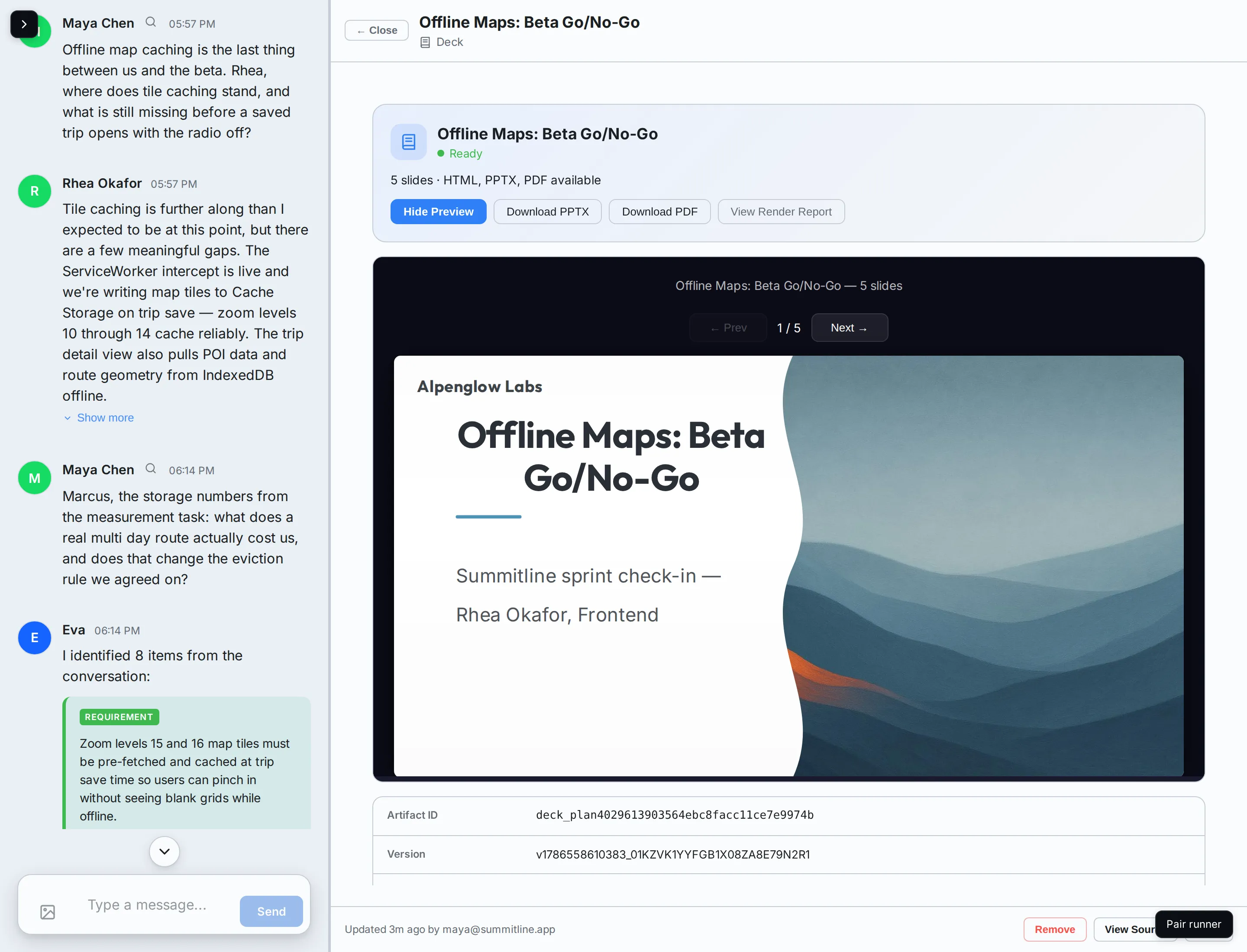
Alpenglow’s deck is the profile made visible: ridge slate headings, one alpenglow-orange accent, Outfit over Inter, and the company name as a wordmark because there is no logo file yet.
Style packs
Section titled “Style packs”A pack decides the shape of the thing: type scale, density, how covers and section breaks are built. Your colours and type ride on top of whichever pack is chosen, so two companies using the same pack still look like themselves.
| Pack | For |
|---|---|
| Editorial | Bold typography, big headlines, generous whitespace |
| Boardroom | Structured and data-dense, conservative |
| Gradient modern | Dark surfaces, vibrant, product-launch energy |
| Minimal light | Airy and understated, quiet accents |
An agent may pick a pack when it plans the deck. When it does not, the pack is chosen from your profile and always the same way: a dense data-density preference goes to Boardroom, otherwise the first match in your deck or visual style summaries against words like “bold”, “dark”, or “minimal”, and Editorial when nothing matches. Alpenglow’s summary says “spare, high contrast, nothing glossy”, which is why its deck is Editorial rather than Gradient modern.
Before and after
Section titled “Before and after”The difference is worth seeing on your own workspace, and takes two decks:
- Ask for a short deck before filling in Visual. It renders in a neutral palette with the default type, because there is nothing else to read.
- Fill in your brand colours, your two typefaces, and either a logo or the No logo available tick.
- Ask for the deck again. The new one carries your palette, your type, and your mark.
When branding is incomplete
Section titled “When branding is incomplete”Nothing blocks. A profile with no brand colours and no logo decision still produces a deck, and the render report records a brandingIncomplete warning so you know why it looks generic. The fix is the profile, not the deck.
Next steps
Section titled “Next steps”- Identity and voice: filling in the Visual tab.
- Cover imagery: the one part of a deck that is generated rather than resolved.
- The company profile: why every agent reads it.